Friday, September 3, 2010

Chug Chug - The Train Pulls In

I love the sound my train kiln makes right after stoking the bourry box. The flames gulp air through the
primary air holes in the lid making the characteristic chugging sound - definitely a sign of reduction.

This time I had lots of reduction in the top half and it seemed to be along the whole length - though it varied, just like the flame signs were one directional. The Shaner oribe turned red, the VCAA green turned a purplish.
I had made two small appliqued vases to test out how they would react to the flames and to the soda.
In the wood only section I had used the watercolour green to highlight the applique then rubbed off and gave it a light spray with bone ash glaze. The bone ash did not react well with the ash - going a grey colour and a sugary white where hit directly.
Bone Ash glazed with a spray of watercolour green on dresses. Left side faced directly into the flames and so turned very grey. Right side had more of a warm colour where it was protected from the ash.

In the soda section the pot had Dan Hill's slips - blue, blue green and rutile, with a light spray of Hanna blue ash on the right upper side. The back had some nice blushing.


Jar from throat arch - lid no longer fits as it had sealed with ash when it got knocked sideways.

I had made some large bottles as it was the quickest way to fill up the kiln. I was a bit worried that it would block the flames but that did not seem to be the case though the large covered jar in the throat arch got knocked over so that may have helped open up the flame path.
 
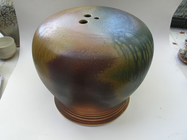
The flat topped orb - had some nice flashing and crystal development on the top - so the slow cooling helped. It was on the bottom just behind the throat arch. It had Aerni colour active blue and brown slips and then glazed with Hanna blue and ochre fake ash glazes with over sprays of rut/GB and Ti/GB.
 
 
The tall bottles were side by side at angles to each other. The Hanna ochre ash glazed one had a bit too much olive green colour where it was hit with a lot of ash. The other one was glazes with mal Davis shino - but was too thin - as no carbon trapping. However the colours were a very warm orange an reds. Not very professional photos as I did them outside and did not have a large enough back drop.


Second Woodfiring in the Newfoundout Kiln

Although it was two months later than planned, I finally managed to get in my second woodfiring at the end of August in my train kiln. I had made a few changes - added an inner row of hard brick on the top on the pot chamber, used two hard brick slabs - 12 x 24 x 2 1/2 for the first part of the kiln roof,- all of that adding extra mass.

First three wood fired stoke sections- mostly glazed
I also used extra insulating bricks on the lid - as well as an old kiln lid that was 4 inches of insulating brick, as well as a fibre blanket and some old fibre sections wrapped in aluminum foil. I also tried to use soaps where ever possible and added extra bits of shelves, bricks, etc in the stacking to also add mass - all of these to slow down the heat loss - not only between stokes but for cooling as well.

Lid covered with lots of insulation - 6 1/2 inches of insulating bricks near the chimney.
Cone 11 was flat near the top in the first stoke hole and cone 9 starting on the floor near the flue exit. This was much better than the first firing. The firing took 13 1/2 hours and then two hours to burn down the coals before clamming up. All in all very manageable for one person to fire. Unfortunately the clay boat holding cone 012 exploded, resulting in shards in many bowls.


I also used about 1/2 pine and cedar instead of just ironwood which in my first firing had caused too many coals to build up.
This time I glazed most of the pots except for some in the last two stoke sections where I added soda. I placed some small dishes with soda ash when stacking as well as soda/sawdust burritos- the burritos did not work very well as there was still a lot of soda ash left on the floor of the kiln. Some of the dishes boiled over with soda. I also sprayed in some soda.
I did some side stoking - just in the last three stoke holes - maybe a total of a large armful of sticks. Next time i will try no side stoking as that tends sto knock over pots.

Reloading the bourry box - pulling on counterweight lid

Next firing I plan to add more mass to the side walls of the pot chamber especially in the front - maybe that will even out the heat from front to back even more.

Roll up ..er down - the Rim

Sisters - in their  Sunday Best - extruded paperclay square coil on inside to thicken rim
Slab built vases always tend to have weak rims unless you make the slabs thick. Since we pay by the pound for firing at our guild I try to use thin slabs but this leaves me with a very thin rim that somehow looks unfinished and weak. I have tried adding extra slab strips to the rim but would get cracking at the joins especially in the corners. Then I started using a soft clay coil so that there was no discernible join in the corners, roughing up the top seam and filling in with extra clay - still some cracking but just in the top seam. I then switched to a soft paper clay coil and that seemed to eliminate the cracks, however I did have trouble getting a crisp edge.

Rolled down rim - punctuates rim
 The best was extruding a length of paper clay using my clay gun and the small square die. "The Sisters - in their Sunday Best" - has got a rim produced that way. As the back was higher, I needed the rim to show crisply on the inside. 
Another method that I tried was rolling and thus compressing the rim with a mini rolling pin - a method that was suggested to me by Steven Hill in one of our journey workshop sessions. That worked for the small handbuilt box but for large pieces as my slab vases it did not result in a sturdy nor thick enough rim for me. Perhaps if the slabs were softer when I rolled them it would have given thicker results.

But for now it's paper clay and a clay gun  for the slab vases.

Thursday, July 1, 2010

Cup Evolution Over Three Years

I have been getting ready to do another wood firing and so was looking at some of the pots that I had kept around from my first firing. One of them was a cup - it was not the glaze that caught my interest this time but the form of the cup itself.  I had made it in 2007. I took some pictures to compare some of my current cups to that 2007 one which is pictured first below.

I remembered what Steven Hill during the journey workshop had told me about cups- the lips and foot are like punctuation marks and should balance. That wood fired cup - definitely no pucntuation on the foot! As well the handle was not pulled on the cup and was rather thick all the way from top to bottom - no sign of a taper to give it some elegance. Now I have been pulling all my handles off the cup - maybe not always successfully but I feel that they are getting better.


One Plus One Equals Three

The Fusion  Conference (the Ontario clay and glass conference) was the last weekend in May and it a was great to meet with other like minded people in Ottawa. The two presenters were Joan Bruneau from Nova Scotia   and Sam Chung from the US. I liked Sam's work much better and so found his presentation much more useful..

I took two pre-conference workshops - both were with Tom Lambert. One was on how to throw large pots which was kind of a review of Tony Clennel's workshop at MISSA last summer. However it was the second one called "Making Marks" that I found most useful. He demoed his method of spiral distortion, use of thick slips a la Steven Hill, and faceting.  As this was a hands on workshop we were able to practice. I especially wanted to improve the spontaneity of the spiral distortion. However after looking at all the spiral pots I realized that I wanted to add something different as it seems so many people have jumped on this band wagon..

Last summer at Missa I took the weekend handbuilding workshop with Dennis Meiners. He made little sprigs that he would then throw on slabs prior to using them for handbuilding. By throwing the sprigs he was able to get them to stretch a bit and give more spontaneity to the design. His method has been percolating at the back of my mind for a long time now. What I liked was that his sprigs were very thin and the effect was not at all stiff and formal. Instead of using a sprig, I rolled out clay very thinly and then cut out the figure of a person. Then I threw them at the pots. This is harder than it looks and I missed about 75% of the time and about 25% of the time it landed in an inappropriate place. Since the pot was just freshly thrown, the sprig would indent the pots as well as stretch, resulting in a very spontaneous effect. On the negative side it was impossible to remove the sprig if you wanted to without damaging the pot..

Twice the figures ended up absolutely fantastic. One had the legs stretch out and looked like a soccer player and so I added a ball to the figure. The other one was even better and the figure ended up near the rim of the pot and his arm gripped over the rim so it looked like he was trying to climb into the pot. I ended up cleaning the figures up a bit with a ball tip tool to emphasize the relief and added little bits here and there as with the angel tumbler. I've since tried this method some more, but my chance of hitting the pot in the right place is about nil so have put that back on the burner until I have a bit more time as I feel this has great potential.


It's always great when what you have learned in separate workshops comes together and clicks  - resulting in something that you had not expected, something greater than the individual methods.

Now how to glaze the two that I have?

Monday, May 3, 2010

Rapunzel Rapunzel Let Down Your Hair

Some time ago while surfing the web I came across a potter from the U.K. (I think) who had some wonderful handbuilt vases with figures on them, including one of Rapunzel with black hair cascading down the side of the vase. It was done in underglaze pencils and slips I think. I thought the hair as a focal point had a lot of potential for my work

Later I drew a sketch of it (or at least what I remembered of it as I have since lost the website) and added some of my own touches like the fish. For months it percolated at the back of my mind and finally I built one of my appliques pieces based on the piece. It turned out nothing like what I had expected - nothing like the loose lively vase of the UK potter. Ended up very tight, more  medieval looking and because of the fish  -  I called it Rapunzel Goes Fishing.

I had to refire it as cracks developed on the back of the side wing where I had pieced together several slabs to thicken the the wing. I knew that I should have taken the time to roll out another whole slab rather than piece things together but I got lazy. I appled some extra thick temmoku above the cracks, hoping it would run down and cover them, which it did. However because of the second firing the glaze on the hair turned somewhat darker and not as nice as the first time round. Unfortunately I also got several cracks on the inside of the thickened rim which opened more the second time round. I thought that I had that problem solved by using paper clay and using it quite wet so there was no join and then slowly drying it all.

I have since tried finding the website of that potter that inspired me but without luck - so if anyone recognizes that potter I would love to see her pot again.

Sunday, April 18, 2010

Slip and Shellac Resist

Years ago before I was aware of the dangers of using hot wax I used to do resist "carving" with real paraffin wax. It wasn't until I read about shellac resist a few years ago that I came back to do this type of decorating technique.


The shellac dries quite quickly - in about 15 minutes. By wiping over with a wet sponge you can get relief designs in the clay as the shellac prevents the clay from being washed away. I like to paint an area with coloured slip first and then shellac, so the raised area is a different colour.


I had done some designs with pears, first trying various slips on tea bag rests and then after some sketches on some serving dishes. I use the Bringle slip with 10% black stain and cover it with Fraser Celadon with a bit of stain as well (as per Elaine Coleman's recipe) or just the clear celadon without any iron in it. I don't get a really nice blue nor white colour as I use Harlan House porcelain and it tends to grey the colour a bit, but it is very easy to work with.


New Year, New Decade


It took me almost 4 months to complete this post but I hope to get back on track with writing at least several times a month.

Jan/2010 - Time to get focused again on pottery after the holidays. On our way back from Florida visiting relatives we had a great visit to Ashville to see the New Morning and Blue Spiral Galleries. We also found our way into Penland as we decided to drive over Roan Mountain in North Carolina - what a spectacular place - both the mountain and Penland. Visited Cynthia Bringle there - one of my heroes and stopped by John Britt's place who is just down the road a ways. Unfortunately he was out but I could see lots of test tiles on his studio table!

Did lots of sketching on the drive down - it's someting that works well for me as I just sketch whatever interests me at the moment and then for several days I work on variations. Usually I do not have time to do too much sketching at home, but this was great and helped to while away the time on the interstates. On the way back I usually had to drive as my husband found my navigating on the back roads to be rather unreliable.


The sketches for the small oval serving dishes had lots of movement in them but once back home I was had a hard time trasferring that into reality. The dishes are made of porcelain, thrown, altered and a flat base put on. I pierced the overlaps and hoped that the celadon glaze would cover the holes and let light through which it did. Will need to work more on these as I rather like them, but as you can see in the close up the inside of the hole arrangement is rather messy.