Sunday, September 9, 2018

Inspired - Dumoine River Art Camp 2017 - Part II

"The next day we set off to explore, using the buddy system for safety.  Several of us set up at Grande Chute while others canoed further down Robinson Lake to the next set of rapids. The river trail along the Chute is rough, and has spectacular rock falls with some boulders the size of small houses.  One could only imagine what the people travelling in this area felt thousands of years ago. Like us they must have been in awe of the power of the water and like us they also feared the churning rapids – and one could only wonder how many travellers have been swept away by the swirling currents. 


"Hear the Rapids Roar" wall plate by  Eva Gallagher inspired by stay at Dumoine River Art Camp. Photo credit - Scott Haig 2017.

In the evening we sat around the campfire and traded stories of canoe trips and art experiences.  We also discussed Wally Schaber’s book on the Dumoine, “The Last of the Wild Rivers” and how important the River was to First Nations people as a north/south highway. 
The Indian Point Pot
I had brought clay for everyone to make a pot the way the aboriginal people made them here thousands of years ago as evidenced by the “Indian Point Pot”. Radiocarbon dated at 2500 years BP (before present), it was excavated during an archaeological dig at Indian Point across from Deep River in the early 1950’s and is now on display at the Museum of Civilization in Ottawa. One evening we sat around the fire, surrounded by the dark forest and silence, channeling spirits from the past. We coiled the clay into a beehive shape that was then turned over and pinched, paddled and scraped into a thin open vase. It could have been an evening thousands of years ago, our hands repeating the same motions made millennia ago and resulting in pots very similar to the Indian Point Pot – with a flared lip and a rounded bottom to better withstand the thermal shock of cooking over open fires.
Eva Gallagher (center) demonstrates how  First Nations first made pottery in this area thousands of years ago. Photo credit Scott Haig 2017.
I came back from the camp energized, ready to continue working on several pieces that I had started at the camp. In October CPAWS hosted a very successful gala and silent auction of the donated art in Gatineau at “The Moore Farm”, a National Capitol Region restored post and beam barn that is open to hosting various events. With featured guests, singer/songwriter Ian Tamblyn, artist/environmentalist Robert Bateman, the event raised over $11,000 for the Dumoine River project." 
The idea of an art camp - that idea of bringing together artists to work on a common theme are becoming more popular and I highly recommentd this type of experience . Hopefully CPAWS is going to offer another Dumoine Art Camp in August 2019 so in interested look to apply early in the spring.of 2019.

Inspired - Dumoine River Camp 2017 Part I

Again I am way behind in my blogging so here's my effort to catch up by reprinting an article that I wrote about the Dumoine River Art Camp last August 2017. - my first art camp experience! The Dumoine River is a famous canoeing river that joins the Ottawa River about 20 miles west of Deep River. My article was first printed in our local paper the North Renfrew Times last year.


"Mention the Dumoine River and it conjures up scenes of rapids, lakes, canoe paddles and portages. But art? Not so much! But that is what The Canadian Parks and Wilderness Society – Ottawa Chapter (CPAWS-OV) was offering to artists last August – an Art Camp on the Dumoine. There was  one this year as well!
         Bridge over \Grande Chute attracts art camp participants. Photo credit - Scott Haig 2017

It is all part of CPAWS-OV effort to raise funds to preserve the Dumoine River as a protected wilderness river for future generations. As they state on their website, “it is the last un-dammed Quebec tributary of the Ottawa River and one of only a few rivers in central Canada free of dams.”
In return for offering free tent accommodation and meals (CPAWS staff turned out to be excellent cooks!), the artist would get to stay for up to 6 days at the camp. They would then donate a work of art, inspired by their stay, for a silent auction at a gala in Ottawa in October. Here was an chance to meet other creative people in a unique environment. Always open to new artistic opportunities I applied as the life of an artist is not a destination but a journey.                 
 We were to camp at Lake Robinson, that widening of the Dumoine River just below Grande Chute. To minimize parking, we met up in Swisha to carpool to the Lake. Kids leaving for their first summer camp couldn’t have been more excited than our group! It was a challenge to load all our sleeping bags and mats, folding chairs, boxes and suitcases of art supplies, easels, cameras, and tripods, including my box of clay and tools into the few cars that would be driving up the rough road.
Although it has been many years since I have been up the Dumoine, I still remember that first drive over 50 years ago – up along the rough road past the old Bonanza Inn and the long-closed downhill ski hill and tow on the hill opposite. It was always an adventure there to drive into the unknown, but one always had to be wary of meeting a fully loaded lumber truck that might come around the corner. One year we even skied to Grand Chute after driving part of the way. 


Lake Robinson Campground

The fifteen artists who attended were a pretty diverse group, not only in age, spanning six decades – but also in artistic media. There were several photographers, a glass artist, botanical illustrators, acrylic and watercolour artists, both realistic and abstract and of course potters. We came from as far away as North Bay, Vankleek Hill, Ottawa, Pembroke, Shawville and southern Ontario. There were two of us from Deep River, photographer Bruce Winterbon and myself.
As part of our orientation, one of the CPAWS staff – conservation biologist Elena Kreuzberg took us on a nature tour. The Dumoine watershed is huge, covering 4400 km2 with some of the last remaining stands of old-growth forest in eastern North America. The area is also important as a connection between Algonquin and La Vérendryer Parks, acting as a corridor for animals moving further north from southern areas. This will be even more important as the climate continues to get warmer."

Sunday, January 1, 2017

Rebirth!

I see that two years ago in Jan 2015 I wished everyone that creative high - the joy of making. Well for 2016 I really needed to wish that for myself. as this past year has been a very slow year creatively speaking. I feel like I am wading though deep mud or snow, with new ideas stuck and I have had to really struggle to get them out.

I will give myself another week to clean up my work space in the basement - it is really cluttered with too many things that need to be thrown out. After that I will start sketching again - it is the best way to generate new ideas - and then hopefully there will be a rebirth of new ideas.

One idea that I plan to pursue is getting impressions from germinating seeds.
Germinating wheat seed impressed in clay
This little tea bag rest (above) embodies a fresh start, a new beginning - it was a serendipidous event! In 2015 I had collected lots of wheat stalks from the Saskatchewan farm where my son and his wife were married. I  made a platter with wheat stalk impressions on it as a wedding present. Several days after impressing the clay I noticed that a seed had fallen from a stalk head and was germinating in a little pool of water by the sink where the tap was leaking. I decided to impress it into clay. Once tile was bisqued it was brushed with gosu slip and wiped off and then glazed with Malcolm Davis shino and a little spray of magnesia mat glaze.
It was amazing the details that showed up - even the very fine roots.

I will have to visit the local farm supply store soon as I think that a platter with rows of different seeds germinating - wheat, oats, peas, corn, etc, would make an interesting piece - and with it symbolizing a rebirth of creativity.  Happy new year!

Sunday, December 18, 2016

Canoe Culture - A Series of Collaborative Workshops and Exhibitions Part II

The Canoe Culture project encouraged people to think more professionally about their work, as photos, artist statements and bios were required with each entry. It would also challenge members to try new ideas, techniques and styles.

I think that we all felt this was a difficult theme and most of us had a hard time thinking about what to make  (apart from canoes). I spent many months mulling over ideas, looking up historical facts and so for me it ended up being a very enriching experience. Often when I look out over the river, I try to imagine all those huge voyageur canoes battling head winds and waves as they paddle their furs to Montreal.

What the jury focused on was:
1. Works that are stylistically or thematically focused on the Canoe Culture themes of water transportation in northern Ontario and how stops along this ancient waterway shaped the communities of Deep River and North Bay.
2. Works that display technical acumen, and/or observation and original style.
3. Works that are important to the cultural discourse of the region.

 We were all allowed 4 entries and below are my four entries that were accepted.

My work for this exhibit was inspired by the Ottawa River, the fur trade and the design of the "made beaver" - the stretched beaver pelt dried on a wooden frame made by bending and lashing together branches into a circle.

Over 400 years have passed since the first Europeans traveled the Ottawa by canoe to North Bay, driven at first by a search for a route to China and then for furs, especially beaver pelts that were eventually felted into hats for European customers. For 200 years the stretched and dried beaver pelt - the "made beaver" - was the "currency" in trading with first nations inhabitants.

"One Made Beaver" -  Eva Gallagher, Deep River


Made Beaver Currency
         1 MB  =  1 brass kettle
                    = 20 fish hooks
                    = 2 1b of sugar
                    = 8 knives
                    = 20 flints
         2 MB  = 1 gallon brandy
         20 MB = 1 rifle
       Taking into account inflation the price of “one made beaver” in today’s’ dollars would be about $45.

As Deep River is home to Canada's nuclear pioneers, the Ottawa has seen the progression of ideas and knowledge from 10,000 years to the present - from hunter-gatherers that first came here after the retreat of the glaciers to today when scientists work with one of the most important discoveries know to man - nuclear fission.

"La Riviere Creuse - From Beavers of Atoms:" - Eva Gallagher, Deep River
Riviere creuse is French for deep river and it is what this part of the Ottawa River was called by the early travelers.)

"Portage" - Eva Gallagher, Deep River
(Didn't have back drop wide enough for picture.)
On the shores of the Ottawa one can find chewed off beaver sticks and stones, all beautifully weathered and I have incorporated them into another piece as a tribute to the voyageurs who risked their lives running the treacherous, rocky rapids to bring their beaver pelts to Montreal.
"Voyageur's Tribute" - Eva Gallagher, Deep River.
Stoneware with beaver-chewed stick, stone and leather cording.
This project really encouraged further collaboration between our two guilds and hopefully there will be more joint exhibits and workshops in the coming years.


Saturday, December 17, 2016

Canoe Culture - A Series of Collaborative Workshops and Exhibitions Part I

As 2016 winds down I realize that if I want to record the significant pottery events that happened this year I really do not have much time left - so here goes!

What happens when the oldest potters’ guild in Canada meets with the newest? The Canoe Culture collaborative project! In 2014 the Deep River Potters Guild (1954) was contacted by North Bay artist Dermot Wilson, who shared with us the great news that they had just formed a potters’ guild in North Bay! And would we be interested in collaborating on a series of workshops and exhibits?

Dermot successfully applied for an Ontario Arts Council grant to help pay for the project and the Canoe Culture project was born. Its theme is based on the historic Ottawa River to North Bay paddle path used for thousands of years by North America's First Nation inhabitants and then by the voyageurs and settlers who followed in their wake.

The project brought together ceramic artists from our two communities in near-northern Ontario. How does the water route and history shape our vision of our sense of place? What do we see and feel when we look out over the river, when we go to the beach, or go out in our boats?

Opening exhibition in Deep River Library April 2016
The project included a series of hands-on pottery workshops. In the spring of 2015, North Bay potter Keith Campbell, gave a workshop in Deep River and Eva Gallagher, Ligita Gulens and Marg Killey reciprocated in the fall in North Bay, exchanging ideas, techniques and enthusiasm.

The project culminated with two month-long exhibitions of ceramic works created especially for this project The exhibits were juried by Pat Stamp, a North Bay potter, Cathy Walsh, a Deep River artist and retired Mackenzie High School art teacher and Dermot Wilson. The 16 artist show opened in North Bay in mid November 2015 at the Whitewater Gallery and in April in the Program Room of the Deep River Public Library.

The potter works ranged from canoes, the fur trade, a paddle, clay fish impressions to more absrtact ideas such as stretched beaver pelts and crows (representing the Jesuit missionaries). Unfortunately I do not have many pictures of the exhibits, but below are a few that I did mange to take of some of the other artist's works.

"Montreal Ghost Canoe" - Glenda Mikawa, North Bay


"Artifact -  Sir Samuel de Champlain Paddle" - Keith Campbell, North Bay 
"Voyageur" - Betty Ackroyd, North Bay

"Birch Bark Canoe" - Peter Brewster, Deep River

Thursday, March 31, 2016

The Colors of Deep and the Sisters of the Traveling Mug


I have a friend who recently bought one of my mugs. She told me that she carries her mug with her everywhere she goes, so I asked if she would write a guest post about this for my blog. She writes:

"I am a Deep River gal, born and bred, and I love this land. I love the granite outcroppings and the abundant fresh water in the glorious Ottawa River, lakes, streams and wetlands. I love the tall pines and the mixed deciduous/coniferous forest and I have a deep understanding of the complexities of this ecosystem - what lives here and why, from the bedrock to the tips of the tallest tree. I spend time outside every day, just soaking up the beauty of this habitat, this land, and feeling profoundly grateful that I live here. This is home, in all its extreme seasonal changes, and I feel connected to this land; it is part of me. When I travel, I carry pieces of the land with me, like talismen, to remind me of where I come from and to call me home.

There are several pocket rocks that have traveled thousands of miles with me and in recent years, I have also carried a mug from home. There is such comfort in starting each day, even in a far away land, with a cup of tea in a familiar and beloved mug.
Thanks Anne for the photo of my (now yours) "traveling mug" reflecting the colors of the Ottawa River

I have a favourite mug, crafted by Eva Gallagher, which captures a sense of the river, the Laurentian Lowlands and the trees and it has become my "traveling mug". The mug has accompanied me on trips to Bolivia (La Paz, Rurrenbacque jungle, El Choro mountain trek), Costa Rica (Playa Guiones), Nicaragua (Ometepe Island), North Carolina, St Joe's Island, and Pukaskwa Park on Lake Superior, Prince Edward Island (all over), New Brunswick (Douglas), and countless shorter trips around Ontario by plane, train, car, canoe and kayak. It fits securely in the cup holder of my car and happily holds a Tim Horton's medium.

I bought the mug at the Valley Artisans Coop a few years ago because it met my criteria - sit comfortably in my hand with good balance and with a pleasing colour palette. I prefer a slim profile in a mug since I hold it by the body instead of the handle. 

One day, in the fall of 2015, after dropping my son at school, I was driving along the waterfront near Centennial Rock, sipping tea from said mug, and was literally stopped dead in my tracks. The sunlight on the hills across the river, the colour palette of that breathtaking scenery was exactly what I held in my hand, on my mug. I pulled into the Centennial Rock parking area and got out, held the cup up in front of me and took a picture (or 10). Eva had captured the spirit of the river perfectly in the form and colour of the mug. Beautiful!

Last week, I was in the Potter's Guild, looking out the lovely new windows towards the river and was struck anew of how well this mug captures the essence of Deep River.  The Ottawa River is the heart of this community, it defines the landscape, it pulls me home and with this mug, I carry a piece of that wherever I go.  

Every day I am struck by the beauty that surrounds me in Deep River and I pause to appreciate the details of the perfection: frost designs on puddles and leaves, dew drops on spiderwebs, fog in the marina, rainbows, sundogs, sparkling snow sculptures. I am grateful for artistic skill which can capture the beauty in a functional and fabulous form.

Today, I leave for Sumatra so the adventures continue. Mug in hand, off I go...

Anne Davies March 28 2016

Inspiring words Anne - and have a wonderful trip!  Deep River is indeed a special place to live. Anne had ordered more of the same mugs to give to her sisters and friends so that they too can have a piece of Deep River and they have all become "Sisters of the Traveling Mug"! I decided to donate the proceeds from this commission for our new windows at the Guild - so we can all see that same million dollar view of the Ottawa River as we make and glaze our pots.
Three of the sisters of the "Travelling Mug"
One of the "Traveling Sisters" in Sumatra with Anne

The descending swirl in the cup design was inspired by courses that I took from Steven Hill and Nick Joerling. I then embellished them - I stamp on a few vertical lines with the end of a wooden stick and add stamped swirls.

For glazing - first Watercolour Green is brushed on and rubbed off, staying only in the impressions. Then the bottom is dipped in a glaze that comes from cleaning out the spray booth - so will not be able to duplicate once I run out!  I then brush on some Dan Hill Lithium Blue Slip, near the top and Strontium Crystal Magic near the middle. Then I spray with Hannah Blue Ash, Van Gilder Blue Ash near the top, a Magnesium Mat in the middle, and a very light  spray of Aerni Ash (no colorants) on top half, an extremely runny ash glaze, just to ensure lots of movement. It is fired in reduction - gas kiln to cone 10.

The last batch I found was not quite as pale yellow in the middle as the one Anne bought .It had more more grayish-white than  yellow, but then over all the swirl lines were better. It takes a lot of practice to get things right!

It's been a while since I have blogged but I am determined to give it another go to write more regularly - it really does motivate me to think about what I am creating and why. So another thank you to Anne - for giving me a reason to get back to blogging!

Sunday, November 29, 2015

Draw!

Last year I attended an estate sale in my town. It belonged to an early member of the Deep River Potters Guild who was a member in the 60's and early 70's. I bought several of his early pieces to give ti our Guild for the "Former Members Gallery". They were bright orange and yellow.- a testament to when lead glazes were popular. However what attracted me was his collection of pottery books - including "Ceramics Design" by John B. Kenny published in 1963. Although dated in terms of design, it is nevertheless inspiring with lots of great ideas.

In the forward about what is design he writes - ."..to a ceramist, design means more than that (arrangement of detail) - much more. It means order out of chaos; form out of shapeless mass...... It is something for which he must search, and when he finds it, his work is satisfying and good. His quest is never ended - he must go on searching as long as he lives and works."  Great words to live by!

However the best part of the book for me was the chapter titled "Draw!" Very few pottery books go into any detail on how to go about practicing your drawing for pottery - he devotes 9 pages to it and outlines various exercises that one can do to practice drawing.
1.Keep a sketch book and use it frequently.
2. If you are not used to drawing he suggests you start by making quick sketches of things you see - don't worry about being accurate.
3. Look at an object for a few minutes and then draw it with your eyes closed
4. Make a drawing of a familiar object without looking at it.
5. Warm-up exercise - stretch out your arms and draw in the air - write your name and write it backwards.
6. Make memory drawings of people doing things - playing an instrument, kicking a ball etc.
7. Do large quick drawing on a blackboard - bold sweeping continuous lines. Seeing white lines on a black lets you see drawings as negatives and you get a different perspective.
8.Try drawing with different things - pen, pencil, bushes.
9. Try using newspaper for brushwork - practice with brushstrokes to show expression, images with just one continuous brush stroke.
To help with ceramic form and decoration -
1. Draw outlines of various ceramic forms - symmetrical, asymmetrical.
2. Draw your form - circle for a plate and draw various vertical and horizontal lines, wavy and straight, thick and thin .
3. On square plates try out patterns of rectangles, overlapping different colours, some with designs within them.
4. Try out stencils with dabbing on colour with a sponge. Overlap different sponges.
5. Use dots, wandering lines.
6. Use a "design finder" - cut out a 3" square hole in a piece of paper and and move it over your designs to find the best  section.
And his final advice - take good care of your sketch book - it will provide a rich source of inspiration for years to come. I still have my sketch books from the 60's and 70's and it's really interesting to see what how my interests and styles have changed.

Sunday, January 4, 2015

For 2015 - Wishing Everyone that Creative High - The Joy of Making

I often think about what the attraction is to pottery for many people - apart from the wish to make pots magically on the wheel. I belong to the Deep River Potters' Guild which has a fully equipped ceramic studio. These past few years have been particularly rewarding as we have had several really keen new members who have introduced the rest of us to lots of new styles and work and who are not afraid to take on new challenges in terms of the kind of work that they make. Many of them have mentioned that there are so many different aspects to clay - something for everyone - that you can never get bored. They mention how it allows them to be creative and that the creative process often gives them a "high" and how they can get lost in the process. I know the feeling well!

How do you get into that creative high? John Cleese has given several talks on the topic:                               (  http://www.fastcocreate.com/1680999/4-lessons-in-creativity-from-john-cleese )
Several of his tips really resonate with me. First you need to have uninterrupted time and lots of it - at least an hour and a half because it takes about 1/2 an hour to get really into it and then you need time for those unconscious ideas to percolate. Secondly you should delay making decisions about a project until the last minute. We feel a bit stressed if we have not made a decision but by delaying it as much as possible it gives our unconscious minds even more time to come up with more creative ideas. So leave unfinished work around - you will eventually come up with a more brilliant plan on how to finish it.  However once you have come up with a decision, then you need to focus and get the project done.

That need for uninterrupted time is something that has started to worry me. I have just finished reading a book - "A Deadly Wandering - A Tale of Tragedy and Redemption in the Age of Attention" by Matt Richtel. It is the true story of a teenager who killed two people while texting and driving.  The story is interspersed with chapters on past and present research on what technology is doing to our brains and especially to young children whose brains have not fully developed. To be creative we need uninterrupted time - and when I look around everyone is texting/talking/checking emails -so it is getting harder and harder to do! The book explains how each interruption brings a squirt of dopamine in the brain - so these interruptions can become addictive. Then when you need to focus to get your project done - the interruptions again affect your brain's ability - the part that works with the focus and reasoning part - as the research mentioned in the book indicates.

Another tip from John is to work in a group. I find that I love to look at other people's work as I not only learn from it but can also be inspired by it whether it is a beginner or expert!. Although I work mostly at home I do all my glazing and firings at the Guild. All our firings end up as communal so we get lots of members work in each firing - whether it is in the electric or gas kilns. So kiln openings can get rather exciting as we exchange comments and discuss the results! Lots of opinions and that is what gets the creative juices flowing and what makes belonging to the Guild so rewarding.

So here is to finding time, lots of uninterrupted time and making  lots of great new work in 2015!

Saturday, November 29, 2014

You're Invited! Christmas Show and Sale Saturday Dec 5th

It's been a pretty hectic couple of months as I was invited to take part in a Christmas show with 4 other artists - all great talents.
Rosemary Driscoll, fused glass  http://artpontiac.com/studiotour/rosemarydriscoll.html, Catherine Timm, fabric arts, http://www.catherinetimm.com/ , Natasha Walsh, acrylic painter, as well as myself, will be showing at Pam Cunningham's who is a watercolour and mosaic artist.
Copy and paste the link below for more information.
https://www.facebook.com/events/443424999129452/permalink/453428881462397/

Pam lives a short distance from the bridge crossing in Pembroke on Allumette Island, so if you are looking from some fabulous Xmas gifts or just to treat yourself, please drop by on Sat Dec 5th between 10 am and 4 pm. This is the first time that I have participated in studio show so I am really looking forward to it. Did I mention that there will be live music, treats and door prizes?

Apart from my one of a kind pieces pictured below I will have some of my cups and trays decorated with black sand from the Ottawa River as well as other pieces for the kitchen or for the soul.
Cups decorated with black sand from the Ottawa River beaches.
Handbuilt Vase - untitled.

On the Farm #2 -  fired in my wood fired kiln in The Newfoundout.
Now it is down to the wire - I am opening the gas kiln tomorrow and so will not have time to make more before next Saturday - so here's keeping my fingers crossed for some great pieces for the show and hope to see you there!
Driving Directions from Ontario to Pam Cunningham's:
From the Ontario/ Quebec turnoff travel on HWY 148 for
10kms. You will pass St. Joseph’s and turn left on to Range 5.
Travel 2 kms and turn right onto Lapierre. Drive 1.5kms to 49
Lapierre on your left.

Saturday, August 16, 2014

Kicking It Up a Notch!

At our Guild a firing fee for a pot includes bisque, glaze and as many refires as you want. So if I'm unhappy with the results of a firing, I usually try reglazing or refiring- often in electric after a gas firing. Recently I had several pots that just lacked something - were just too boring. What I do with those is that I use an underglaze black pen to kick it up a notch. I find that a fired glazed surface makes using the pen much easier as it does not catch the way it often does on a bisque surface, allowing rapid, flowing marks.
The wall plate below ended up a pretty washed-out shino with some weak carbon trapping in the middle after a cone 10 gas firing. I thought that I would try a design to tie in the carbon trapping pattern and the circle on the upper left using my underglaze pen.


Shino platter cone 10 redux - pretty bland before.
Shino platter after underglaze pen decoration and a refire in electric at cone 6. 
I also took a page from  Nick Joerling and used some blue highlight dots.. 
The refire unfortunately removed the carbon trapping which was pretty weak 
but it warmed up the shino nicely to a more orange colour. 
After cone 10 gas firing - figures do not pop out as much as I would like,
 .
After refire in cone 6 electric and with underglaze pen
outlines, the figures stand out much better.
I feel that this underglaze surface decoration on a glazed surface would probably not be very good on functional surfaces such as inside of bowls and cups. Maybe not even on the outside of pots that would be often used in the dishwasher as I'm not sure how duraable the underglaze pigment is, especially on top of a cone 10 glaze refired at cone 6.. But on non-functional surfaces it can help a pot to kick it up a notch!

Sunday, June 8, 2014

To Decorate or not to Decorate that is the Question - Or in Search of the Simple Pot

Well during this last mentorship with Dan Hill I have been struggling with my platters- I really do love the undecorated, simple pot - but somehow when I try to do that it just does not work for me. I have tried to make the "frames" for my platters without so many curves to simplify - make them look more industrial. So then the interior of the platters I find needs something. However as I look at all the platters below I see that I may not have decorated some of them in the middle but because of the frames they are hardly plain simple pots - they again have a lot of stuff going on. To make a plain simple pot is much harder than I thought - and I'm still searching!
Platter with curvy, complicated rim, inside colour grading from
dark blue green to lighter green in the middle. However that rim says to me it needs
something inside to relate to the frame design. For me the plain interior does not
match the rim
Shino glazed platter with Kanthal wire additions. Some carbon trapping in the middle. Again not quite sure what to make of plain interior. I do like the circle with the Kanthal wire - will try to do more to get a more industrial look and maybe tie into some of my nuclear theme. However it is too bland and so will add some black underglaze pen design in the middle and refire. 

Shino glazed platter with blue underglazes and reglazed in electric with white glaze. With this one I feel the frame ties into the interior decoration - the "rock" on the left part of the frame works well with the forest.

Way, way too much going on - shino frame clashes with the slip and white glaze interior. I think it would have been better if it was all the same colour - either all shino or all white. 


Torso Pots

With my clay applique vases I use a lot of people imagery. So to get a more free-form abstract design I decided to use again printed slip designs from paper for the people imagery. However I found that the figures did not stand out enough - so had to scraffito in the outlines - sort of defeating the purpose of those abstract slips.

I did like the the shape of the vase - went well with the figures and the hands and then added the Kanthal wire for the hands. I was worried that with clay hands they would bread off if bumped.- plus I like gimiky things.

Again the slips did not work out well after glazing. I used a black Bringle slip for the background, topped with blue slip for the dresses, and a rutile slip for the hands and feet and face as well as a bit of red underglaze for the scarves and belts. With a white glaze on top the colours ended up a mostly greyish brown - very dull. I reglazed with a white glaze and black Albany glaze in gas again and the colours were a bit better, but still rather sombre - not what I was looking for.

Front of printed slip vase with underglaze
and scraffito


Back of vase

So to go more abstract I decided to get the pot to become the actual torso -  just the torso. I did put on some slips and wire accents. I used a patchwork design with the slips, stitched together with scraffito lines in black underglaze. This time I used some old cone 6 brown stoneware but had to reglaze as results were not great. After reglazing with Stoney White, Juicy Fruit and Licorice in cone 6 electric the results were better, but the original design of a patchwork dress were lost. - I was sort of looking for the Cinderella effect - patchworks dress on an elegant torso.

Garden Ladies - electric on right with slips and gas on left but reglazed in electric.


On another vase I decided to add a head to the torso - again not that abstract! The head is actually a planter and the whole vase could be used for a small succulent planter. Talk about cutesy and gimmicky! The original shino glaze ended up bland and I had made a mistake in mixing up a new batch of Dan Hill blue slip and it ended up metallic black instead of blue and so did not react the same way with the shino.
So reglazed again with the Stony White, Licorice and Juicy Fruit in electric which improved the results a bit.
I still do not have a really good idea of how to get where I want to go - really strong edgy abstract designs. Its hard to break out of my mold into something new that I am pleased with.

Sunday, March 30, 2014

Get Rid of Curves!

In looking back at my work over the last year or so I realize that many of my pieces include curves, lots of curves. In attempting to do something new - to get a more contemporary, edgy look, with more bold, abstract designs I feel I need to discard the curves. My first series of plates for the Dec mentorship ended up again pretty curved, - discarding and attempting something new is not that easy.. We tend to fall back into the familiar. So small steps.
I also decided to use slips and print them on the pots using newspaper to get a more abstract design. This way in the transfer from paper to pot you get random events such as parts skipping, the paper wrinkling - giving a more spontaneous effect than if it was painted on.
The big problem however has been the glazing. Slips in electric I am familiar with but trying the same at cone 10 just does not work. The last pieces for the mentorship ended up a disaster once they were glazed. I tried 3 different blue slips, 2 rutile lips and three white glazes - unfortunately I did not write down which ones were used on what pot.

Paper printed slips for the blue. I also used a reticulated glaze for the white applique but had to brush it on so the reticulation did not work somehow.I don't know why pouring over brushing should make a difference in terms of reticulation as the glaze had worked when poured on other projects. The base was a shino glaze around mostly the edges and then a white glaze (probably magnesia matt) was sprayed over. Again I forgot to write down which white I used on this plate. Plate also cracked - it was made once the heating was on in the house - I was used to drying stuff during the damper summer weather.
 Other plates I a tried a more squared off rim - adding clay strips in a more abstract pattern.  I'm not a graphic designer so not sure what step I need to take to go abstract - will be thinking about this a lot.
In order to get a more edgy look and get rid of the curves I decided to use strips of clay - and to reference our "farm" join them with "rivets" and showing a "repair" on the right bottom corner - just like homemade repairs on farm equipment. The slips - blue and bluegreen backgroud - were topped with a rutile slip representing jumbled stone fences from our "farm". Again - don't know which slips were used or which white glaze. Also again it cracked - again the drying was too fast as the central heating had come on. I feel this has possibilities and so should follow up with more, but it is hard for me to go completly abstract which I would love to do.

Thursday, January 23, 2014

A Rolling Stone Gathers No Moss - New Mentorship with Dan Hill

Well no sooner had I "graduated" from the Fusion mentorship than I rolled myself over into another one - with Wilno area potter Dan Hill http://www.hillpottery.com/DanHill/index.html.
Cone 6 soda fired urn by Dan Hill

Dan makes cone 6 soda fired work and he has given several great workshops for the Deep River Potters Guild. I've always admired his work. His insight and analysis of his work as demonstrated during his workshops has always been invaluable.

There are 7 of us apart from Dan who will also work along with us. Three are from Deep River, two from the Maynooth area and two from Madonna House - a lay religious community in Combermere. So a very diverse group from diverse backgrounds, experience and ages - which should make for an exciting journey.

Our first meeting was in mid November. In the morning we examined and discussed examples of our work as well as work that we admire - either pictures or actual pieces. I feel that I want to make more contemporary edgy work - I feel that many of my pieces end up being "cutsy". This has been a goal of mine ever since the mentorship with Steven Hill  5 years ago. At that time Steven felt that a more contemporary palette would help - but it is so hard for me to resist the yellow, beige and browns that I love.

We were supposed to bring an example of work that we admire or work that points in the direction that we wish to go. I had brought John Ikeda's cup that he had given me at my summer group woodfiring. I have always thought John's decoration style not only superb but very contemporary.
http://www.ikedastudios.com/www.ikedastudios.com/John_Ikeda_Contemporary_Ceramics.html

Underglaze decorated tumbler by John Ikeda

 John has a strong, forceful, abstract design - nothing cutsy about it. I can look at it for hours - each time seeing something different.

After lunch we discussed what we would hope to achieve with the mentorship - whether it is a generalization - to make better pots - better rims, feet, bowls, etc or to make pots with more movement, or with more elegance, better  design. I plan to continue with the 4 themes that I had with the Fusion mentorship - the nuclear theme, the forest theme, the Bottom Billion, and the dancing girls/women series. With inspiration and guidance from Dan and a mental image of John Ikeda's tumbler I hope to give my designs a more contemporary edge.


Wednesday, December 4, 2013

Graduation! - An Odyssey in Clay

Mainly because of the Four Friends exhibit in September I was totally ready for the Fusion Mentorship exhibit in October that marked the end of our mentorship with Keith Campbell.  By marking three pieces NFS in the "Friends" exhibit I was able to reserved them for the Fusion exhibit.
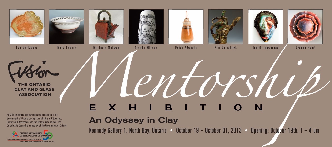
Fusion sponsored three mentorships in 2012 -2013. One in Ottawa, a glass one in southern Ontario and then one in North Bay that I participated in titled "An Odyssey in Clay".

The Kennedy Gallery in North Bay is a great space - a small area for intimate shows, along with a gift shop and then a larger area for large exhibits where one can also host a reception. All this is part of the Capitol Center which also has an auditorium, so people can visit the gallery before a show and during intermissions.

Everyone had outdone themselves - I was really impressed. The work was very imaginative, well executed and displayed to show its best. Unfortunately the pictures that I had taken were not very good - my camera did not like the lighting so I do not have any good pictures of the work. Keith was able to make it to the opening - he had finally had his heart surgery just a few weeks before so it was great to see him up and about. His daughter Alex  is the curator at the gallery and she and Keith put together the exhibit.
Thank you Keith for a great mentorship experience and a great show. We are to meet for our final meeting in January to see where we all go from here. I highly recommend a mentorship experience -especially a group one as you not only learn from your mentor but from all the other mentees as well.  It makes for a great group dynamic!
And thank you to Fusion - the Ontario Clay and Glass Association for getting the ball rolling on these mentorships! I hope that many of you will get the opportunity to participate.

Thursday, October 17, 2013

Four Friends, Four Perspectives - Part II

Apart from the "nuclear theme" I had several other themes for the exhibit. I had sort of abandoned for a while some of my themes that I had started in the mentorship program but then returned with "the bottom billion" and the "forest theme"which morphed into the "Ottawa River series". In early April I had attended a talk at a local museum on the Ottawa River and aboriginal archaeology. It really inspired me to think about what it must have been like here over 10,000 years ago at the end of the last Ice Age.
The Ottawa River levels fluctuated rapidly and widely back then, even reversing flow at one time and flowing into Hudson's Bay. I tried to imagine what this very landscape must have been like back then, a cold, white towering world, with rocks, boulders and ice chunks littering the ground. It is now thought that people inhabited this area much earlier than thought, even maybe as long ago as 14,000 years, living and hunting at the base of the glaciers. 
This inspired me to do an Ottawa River series of platters - again over the garbage can type. They were fun to do! I always remember Tony Clennel admonishing potters to reference thier location. I have always wanted to make rocky mountain type scenery, sort of what Les Manning does, but there are no glaciers here! But after that talk on the Ottawa River I realize that I can use glacier images even though I do not live out west - just include an a short write up on what inspired me and voila! The Ottawa River Series with glaciers is born! All cone 10 redux with MD shino over Dan Hill lithium ship (blue areas) or over white crackle slip. Some overspray with magnesia matt (white areas) and edged in Temmoku.


I added black sand stripes to the design, sort of indicating erosion, rocks etc.
However it is hard to apply with a brush and I find my brush stokes rather inept,
detracting from the design - otherwise I was pleased with the overall effect - MD shino over
Dan's lithium slip (top right), then white crackle slip (which did not crackle) for the ice
and then some overspray with magnesia mat.

Same problem with the black sand. Also whole design is a bit Disney like - just too
cutesy - expect Bambi to appear at anytime.

This is the first one of the series that I did. The crackle slip on the ice portions was close to flaking
off so I reglazed with  a cone 6 electric white glaze to stabilize the surface - those are the white
dots which unfortunately are rather distracting in the design.
The theme still needs more work and the glazing effects are not that cohesive, but I am looking forward to exploring this theme more.


Saturday, October 12, 2013

Four Friends, Four Perspectives - Part I

When a friend of mine asked me last spring if I wanted to get together with her and 2 other friends and do a show in the local library in September I said yes. I thought that it probably would not entail that much more work as I would have to have work ready for the mentorship exhibit later in October in North Bay. However the mentorship exhibit requires just three works from each of us - for the library I had a 30 foot long wall to fill. But I like deadlines. In fact I need a deadline to get things done, otherwise I fritter the day  away on various inconsequential tasks. 
The show was a great success - with amazing work by the other three artists (sun dyed fabrics, fused glass, found art and paintings) and lots of great comments and sales. And now that's it over I've been able to catch up on my blogging.
Since Deep River is the home of Canada's nuclear pioneers, I thought I had better do something with my nuclear theme. I would do the cups with various pro-nuclear slogans. I had no idea how I would put them together into a display. I was stumped. Then on waking one morning just a few days before I had a true insight! (Thanks Johan Lehrer!) I would use my GAIA "bricks" that I had wood fired for another project and put them together with various bricks and soaps from my wood kiln and build as "industrial" wall to stand them on. Good thing the table was sturdy as it sure ended up heavy. Not sure if when they were all together like that that the cooling tower concept came through.
Nuclear cooling tower cups for the 45% - % of people worldwide that support nuclear energy

In the front Candu reactor cups for the 36% - % of Canadians that
support nuclear energy. Candu reactors are Canada'system of reactors and they do not have cooling towers.

I added a fat lady holding a Candu fuel bundle with the caption "It's Not Over Until the Fat Lady Sings." However I don't think that anyone got it - i.e. the nuclear option is not over yet.
The display was accompanied by this write up and challenge:
It’s pretty hard to beat a great slogan!
For decades “No Nukes” has carried the environmental movement against not only nuclear weapons but nuclear energy. Nuclear energy in the 1950’s and 60’s was heralded in by its own great slogan, “Energy Too Cheap to Meter”.
But today the fuel rods and bundles have all been put on the back burner by governments around the world and the future of the industry is no longer glowing brightly. I challenge all that support the nuclear option to come up with a new slogan that can fight back and help achieve a sustainable future for our planet.

Sculpture Workshop with Darryl Frost

When Darryl Frost, a New Zealand anagama potter and sculptor, emailed the Ottawa Guild of Potters that he was staying in Ottawa for a few months and would be interested in helping out with a wood firing and perhaps do a workshop as well, the Deep River Potters Guild took him up on his offer of a one day sculpture workshop for the end of August. We started off the evening before with the usual great potluck supper, followed by Darryl's slide show showcasing his wide range of sculptural work and his anagama kiln in New Zealand.  http://playingwithfire.co.nz/about/my-anagama/  This got us all inspired to think in terms of more sculptural pieces. The next day was hands on, and we continued well into the evening- working on our own sculpture, from small abstract pieces to life-sized herons! He also enthusiastically demoed several of his special throwing techniques. Especially interesting to me were his "tea bowls" - made of a very rough groggy clay that he partially opened and then he inserted a ball of smooth porcelain clay and continued opening and throwing so he ended up with a very rough tactile exterior and smooth functional interior. They were fantastic! He is a very loose thrower and it was a great contrast to most of us who are very tight! Everyone agreed the workshop was a great success - that it was great to get thinking more than just "round pots" and several were even inspired to continue to make more sculptures!
Darryl Frost, helped by Jessica Brabant, holds up his series of rough outside, smooth inside
 "tea bowls".
Thanks Darryl -  for a great workshop and have a safe return to New Zealand!


Sunday, October 6, 2013

A Group Effort - Eighth Firing of the Newfoundout Train

Still playing catch up with my blog! With having to focus most of my work during the last part of spring and early summer on producing larger pieces, especially platters, (which do not fire that well in my small wood fired train kiln), I was lacking enough pots for a wood firing this summer. Fortunately a New Zealand anagama firer, Darryl Frost, http://playingwithfire.co.nz/ happened to be staying in Ottawa for three months. He had put out an email through the Ottawa Guild of Potters that he was interested in helping with a wood firing in the Ottawa area. I contacted him and when we went to Capitol Pottery Supply for him to buy some clay, we met a couple of potters from the Ottawa Guild, Marie Hennessey http://www.ottawaguildofpotters.ca/see/gallery/marie-hennessey and John Ikeda  http://www.ikedastudios.com/www.ikedastudios.com/John_Ikeda_Contemporary_Ceramics.html . John does earthenware - exquisitely coloured abstract designs that I have always greatly admired. He said he was ready to explore other firing methods and so they also expressed interest in taking part. Then another potter form Madonna House in Combermere - a religious lay community about an hour away from our farm
was also interested. Perfect!
Now I would have enough pots to fill the kiln - and not only that, Darryl had contact with Mike Doxey http://www.mdoxey.com/mdoxey-pottery.html who has a wood fired kiln about 2 hours way from me and he was interested in partaking as well. Now with 5 people to bring pots and with two expert wood firers to load and fire my kiln I was all set!
Our "farm" and my kiln is located in "The Newfoundout", an abandoned farming community high in the Opeongo Hills of eastern Ontario. It is off the beaten track - up a very steep, rough road and then just a track slaloming through big rocks in the front fields -so I was a bit apprehensive about cars making it in to the back where the kiln is located without hitting any rocks - but all were not only great potters but superb drivers.
Apart from my very first firing this is only the second time that I had a group firing - and it made the job so much more enjoyable, not to mention easy on the back - plus with overnight shifts we were able to fire longer then my usual 14 - 15 hours.
Almost done loading!
Fire outside the firebox at the start

Firing on the hobs
Darryl loves crusty surfaces - although not my favorite I can appreciate them. He stacked and wadded with seashells and placed his pieces over the channels under the stoking holes where I would never think of placing items- but in the future I think I can make some pieces that would take advantage of this intense ash buildup.
Several things that I learned - bring the temp up much more slowly at the start - even start the fire outside of the firebox at the start - so as not to stress the kiln furniture. I have had lots of problems with the lid shelves on my kiln cracking and that could be why. After just 8 firings that should not really be happening.

They also side stoked at lot more than I would and the temperature was much more even through out. I think it is just too much hard work when one is firing all by oneself to do much side stoking.

Darryl clammed up the kiln at the end with a very runny slip mix of clay and grog and applied it with a brush. I was used to using a thicker mix that I applied with a spatula or by hand which was much more time consuming. He also did not fire down before shutting everything up as I did, as Steve Harrison in his book says that you may end up with reduction cooling if you do.

The results - well we all had some great pots, some failures but all in all a successful firing with results very different from my firings. We had pretty even temps and ash through-out but hardly any carbon trapping. Instead the shinos ending up a very beautiful, lustrous gold!
Thanks everyone for all the hard work and a great firing!
Darryl's crusty sinkers.
Analyzing the results! Lots of ohs and ah and some ughs too! But that's attraction of wood firing!
You never now what you will get!