
The shopping ladies definitely could stand some highlights. However it is important to highlight areas that are in relation to the drawing. The monk vase was better as the glaze there was more fluid (it was a reglaze) and so the edges of the design were delineated better.

He felt that the least successful of the Rhodes 32 pots was the fishing lady as the top right hand corner and face were all emphasized in white - the white area really did not relate to the rest of the drawing. I will need to be more careful how I spray.

I really liked a Stoney Yellow glaze that Steven had on one of his pots in an older CM article that he had posted on his webpage. I thought that it might be a more interesting glaze than Rhodes 32 - more lively colour than just the cream of Rhodes 32, yet still show darker brown where thin. Will try that glaze as well as some from a line blend that I did from Rhodes 32. One sample with .75 manganese was the colour of cafe au lait, but dark brown where thin and that may be another more interesting choice. Another with 1% chrome is a warm tan so will try that as well.
We discussed my disastrous firing with the ash glazes, how the ash glazes relate to the design and how they can overpower the design. When using two colours, I will need to be careful not to abruptly separate the colours.


Actually the back of the vases where there was no or little design were best. Hi suggestion of having pots with little or no design as supporting pots around a more complicated pot seemed like an excellent suggestion and will work on that as well. Also looked at my mugs. I could really see the difference between the handles pulled off the mug and some of my pre Steven handles which now really look horrible - yet I had thought that they very quite good. Sometimes you cannot see what you are looking at until someone points it out to you. I had tried from time to time with handles pulled off the mug but until Steven's workshop did not have the perseverance to keep trying.


Also the white glaze going over the top was distracting to the overall design - and I had to agree - there was just too much going on.
So I will continue working on the appliqued pots - even though they are getting more and more complicated which I do not really like. Steven thought that I should continue and eventually I will take from these pots what I like best and will end up with much simpler forms. So lots of stuff to work on in the next month - it is nice to have specific goals to work toward and this year long journey workshop seems to be keeping me at it so far.
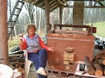
On Sat and Sunday took part in an Art Fair that was organizied at a local nursery that was taking part in the "Rural Ramble". Attendance was really poor and was not worth the effort as sold only seconds. However got several ideas from the imported items that the nursery was sellng as they sell home decor items as well as plants.


No comments:
Post a Comment